Do all colors show equally well in different lighting conditions for home display?
Updated Feb 2026
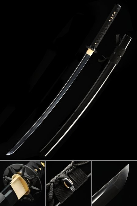
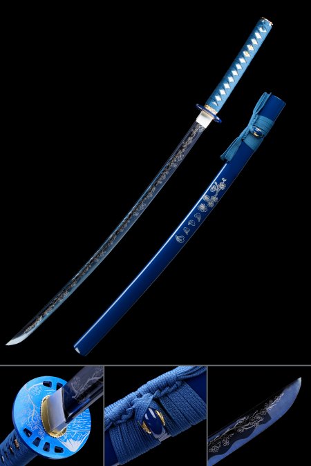
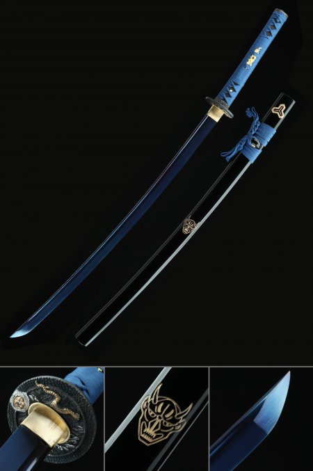
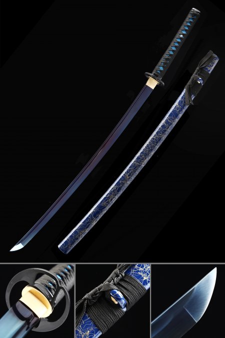
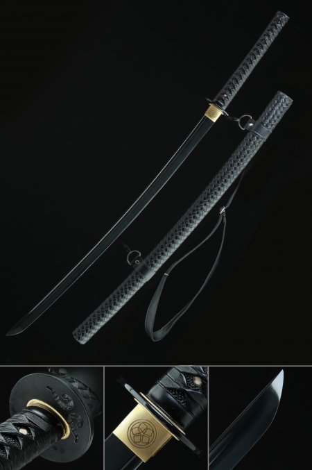
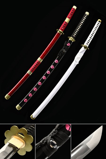
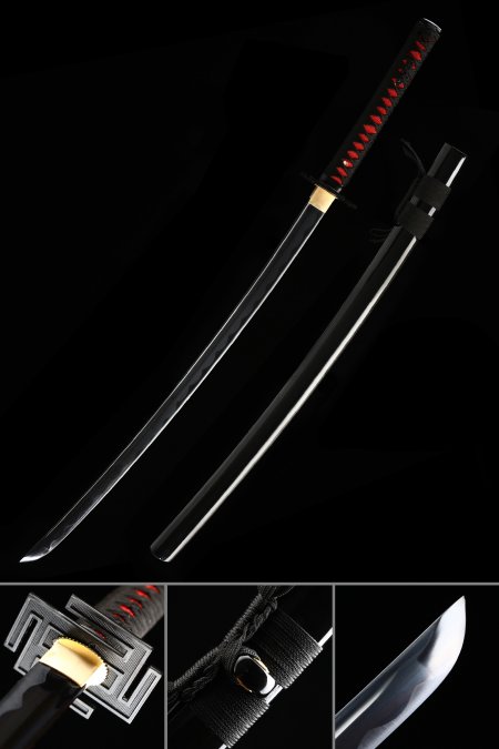
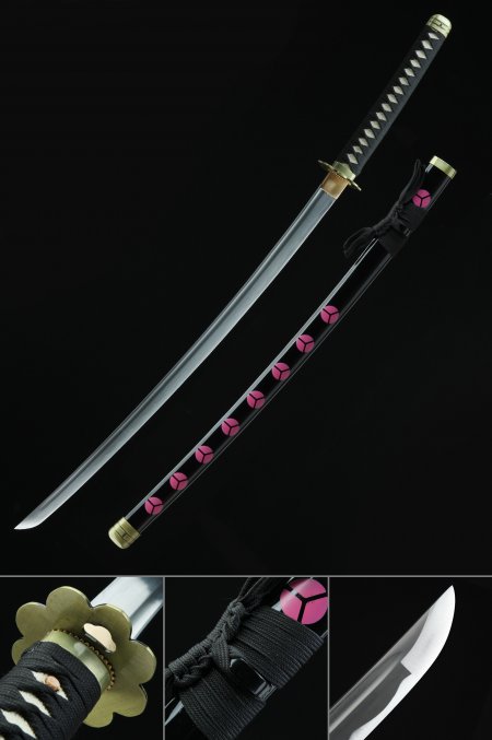
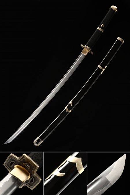
Colors respond differently to lighting, which affects display effectiveness. Red maintains visual impact across the widest range of lighting conditions — warm light, cool light, bright, or dim. Blue and purple appear richest under neutral to slightly cool lighting and can lose vibrancy under warm incandescent light. Green shows best under natural daylight and neutral LED. Black reads consistently across all lighting but reveals surface texture most dramatically under directional side lighting. White and light colors need careful lighting to avoid appearing washed out. If you have specific lighting in your display area, consider how your chosen color interacts with that light source before purchasing. LED lighting between 3500K and 4500K provides the most accurate color rendering for most katana colors.