How do I display a real blue katana to maximize its visual impact?
Updated Feb 2026
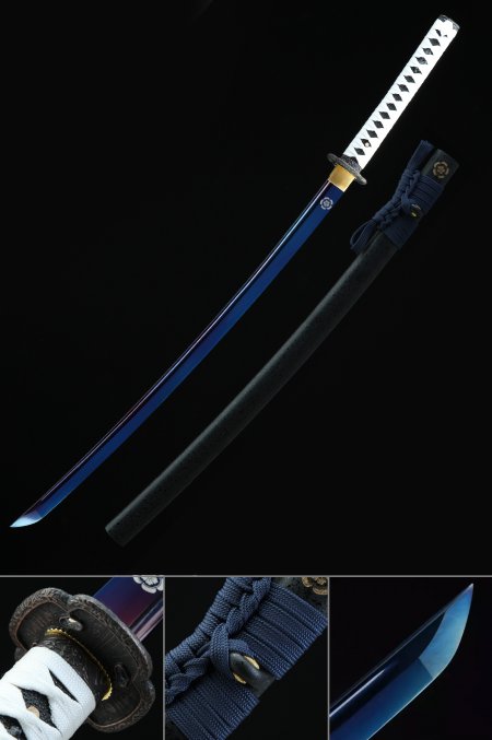
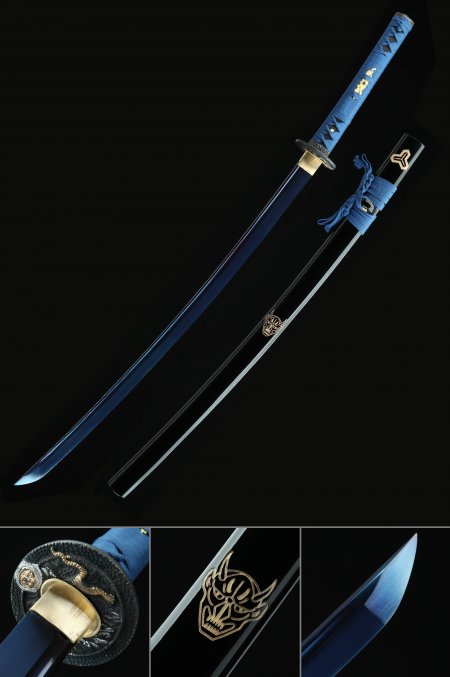
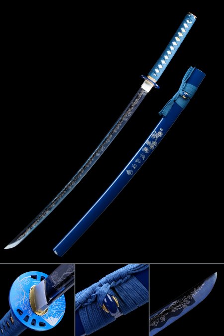
Real blue katana display most effectively when background and surrounding pieces are chosen to maximize color contrast. Blue reads with the greatest visual clarity and intensity against warm-toned or neutral backgrounds: a blue blade katana mounted against a white, cream, or light wood wall creates strong cool-on-warm contrast. Against a dark background, the blue reads more dramatically. In a mixed collection, positioning a blue katana between warm-toned pieces - red, gold, or brown - creates the most visually dynamic arrangement, where the temperature contrast between the cool blue and warm adjacent pieces amplifies both. Standard horizontal wall brackets work for all katana-format blue pieces. If displaying the blade drawn or partially extended, orient the piece so the blue blade surface faces outward toward the viewer for maximum color exposure.